DAMARIS ANAHI IBAÑEZ CARRILLO
50 Terms in graphic design, what do they mean? terms
The purpose of this glossary is to help you remember design terms that are not very common, or simply to help other users know what they mean.
- Alignment/Alineación
- It is the alignment of the elements to achieve balance, order and a more logical design. There are also four types of type alignment - center, left, right, and justified, each with its own time and place of application.
- Example: books
- es: Es la alineación de los elementos para alcanzar balance, orden y un diseño más lógico. También hay cuatro tipos de alineación tipográfica – centro, izquierda, derecha y justificado, cada uno con su propio tiempo y lugar de aplicación.
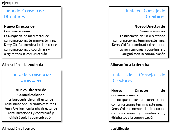
- Alineación/Alignment
- It is the alignment of the elements to achieve balance, order and a more logical design. There are also four types of type alignment - center, left, right, and justified, each with its own time and place of application.
- es: Es la alineación de los elementos para alcanzar balance, orden y un diseño más lógico. También hay cuatro tipos de alineación tipográfica – centro, izquierda, derecha y justificado, cada uno con su propio tiempo y lugar de aplicación.

- Altura de la x
- It is the average height of lowercase letters. The height of the x is named after this because this value is usually exemplified by looking at the height of the letter x in any given typeface.
- es: Es la altura promedio de las letras minúsculas. La altura de la x lleva este nombre porque este valor suele ser ejemplificado al ver la altura de la letra x en cualquier fuente tipográfica dada.

- Análogo/Analogous
- It is a color scheme constructed from three colors that are next to each other on the color wheel or color wheel.
- Example: In interior design
- es: Es un esquema de color construido a partir de tres colores que están al lado del otro en el círculo cromático o rueda de color.

- Ascendente/Upward
- It is the part of a lowercase letter that extends above the height of the x. Some common examples are 'b', 'd', 'f', etc.
- es: Es la parte de una letra minúscula que se extiende por encima de la altura de la x. Algunos ejemplos comunes son la ‘b’, ‘d’, ‘f’, etc.

- Boceto de Thumbnail o Miniaturas/Thumbnail or Miniatures sketch
- Thumbnail sketches are rough drawings, or potential design or solution concepts. These sketches are used to visualize and develop ideas and concepts by hand, before transferring them to the screen.
- es: Los bocetos en miniatura o Thumbnail son dibujos aproximados, o conceptos potenciales de diseño o de soluciones. Estos bocetos se utilizan para visualizar y desarrollar ideas y conceptos a mano, antes de pasarlos a la pantalla.

- Cita del Texto/Quote from the Text
- It is a short quote or excerpt taken from the main text and used as a visual element to help highlight important ideas and attract interest in a piece. Quotes from the text are very common in magazine layouts.
- es: Es una cita corta o un fragmento extraído del texto principal y utilizado como elemento visual para ayudar a resaltar ideas importantes y atraer el interés hacia una pieza. Las citas del texto son muy comunes en diseños de revistas.

- CMYK
- CMYK, from the English ‘Cyan, Magenta, Yellow, Key’, or ‘Cyan, Magenta, Yellow, Black’, is a color model used for printing purposes. CMYK is a subtractive color, which means that we start with white and end with black. Therefore, as we add more color, the result becomes darker.
- es: CMYK, del inglés ‘Cyan, Magenta, Yellow, Key’, o ‘Cian, Magenta, Amarillo, Negro’, es un modelo de color que se utiliza para propósitos de impresión. CMYK es un color sustractivo, lo que significa que comenzamos con blanco y terminamos con negro. Por lo tanto, a medida que agregamos más color, el resultado se vuelve más oscuro

- Colores Cálidos/Warm colors
- They are the colors that make you think of warmth and warmth, such as reds, yellows, oranges, etc. These colors tend to feel more welcoming, friendly, and cheerful. You can add more warm tones to an image or photo by increasing the orange tones in your image.
- es: Son los colores que te hacen pensar en el calor y la calidez, como los rojos, amarillos, anaranjados, etc. Estos colores suelen sentirse más acogedores, amigables y alegres. Puedes agregar más tonos cálidos a una imagen o fotografía al incrementar los tonos naranjas de tu imagen.

- Colores Fríos/Cold colors
- They are the colors that make you think of cold temperatures, such as blues, greens, purples, etc. These colors usually create a calm and relaxing atmosphere. You can add more cool tones to an image or photo by increasing the blue tones in your image.
- es: Son los colores que te hacen pensar en temperaturas frías, como los azules, verdes, violetas, etc. Estos colores suelen crear una atmósfera calmada y relajante. Puedes agregar más tonos fríos a una imagen o fotografía al incrementar los tonos azules de tu imagen.
- Complementario/Complementary
- It is a color scheme constructed from two colors found on opposite sides on the color wheel or color wheel.
- es: Es un esquema de color construido a partir de dos colores que se encuentran en lados opuestos en el círculo cromático o rueda de color

- Contraste/Contrast
- It is the degree of difference between two juxtaposed elements. Some other common types of contrast are dark vs light, thick vs thin, rough vs soft, etc.
- es: Es el grado de diferencia entre dos elementos yuxtapuestos. Algunos otros tipos comunes de contraste son oscuro vs claro, grueso vs delgado, áspero vs suave, etc.

- Cuerpo del Texto/Text body
- It is the main part of text in your design or publication - the written content of a website, the contents of a book, even what you are reading now, everything is the body of the text.
- es: Es la parte principal de texto en tu diseño o publicación – el contenido escrito de un sitio web, los contenidos de un libro, incluso esto que estás leyendo ahora, todo es el cuerpo del texto.

- Descendente/Falling
- It is the part of a lowercase letter that extends below the height of the x. Some common examples are 'g', 'j', 'p', etc.
- es: Es la parte de una letra minúscula que se extiende por debajo de la altura de la x. Algunos ejemplos comunes son la ‘g’, ‘j’, ‘p’, etc.

- Espacio Blanco/White space
- Also called 'negative space', white space refers to areas of a design that have no content. White space is an important design element, as it can help the design 'breathe', help avoid overly complicated designs, and keep designs clean.
- es: También llamado ‘espacio negativo’, el espacio blanco se refiere a las áreas de un diseño que no tienen contenido. El espacio blanco es un elemento importante de diseño, ya que puede ayudar a que el diseño ‘respire’, ayuda a evitar los diseños excesivamente complicados y mantiene los diseños limpios.

- Estampado en Caliente (Foil Stamping)
- It is the application of aluminum heat pressure to certain parts of a design to give it a shiny, metallic finish.
- es: Es la aplicación de presión de aluminio al calor a ciertas partes de un diseño para darle un acabado brillante y metálico.

- Fotografía de Stock o Archivo/Stock or Archive Photography
- It is a professionally taken photograph available online for licensing. Stock or archive photos are typically used in lieu of hiring a photographer, or if a designer cannot access needed images from their own inventory of photographs.
- es: Es una fotografía tomada profesionalmente y que se encuentra disponible en línea para la concesión de licencias. Las fotografías de stock o archivo se utilizan normalmente en lugar de contratar a un fotógrafo, o si un diseñador no puede tener acceso a imágenes que necesitan de su propio inventario de fotografías.

- Gradiente/Gradient
- It is a gradual change in color, from one shade to another. Two common types of gradients are the linear gradient, where each color is on opposite sides of the frame, and the radial gradient, where one color is in the center and the other on the edge.
- es: Es un cambio gradual de color, de un tono a otro. Dos tipos comunes de gradientes son el gradiente lineal, en donde cada color está en lados opuestos del marco, y gradiente radial, en donde un color está en el centro y el otro en el borde.
- Identidad de Marca/Brand identity
- It is the visualization of your brand (see definition above) in a way that represents the values, content and ethics of the company. This can include elements such as the logo, business cards, letterheads, uniforms, packaging design, etc.
- es: Es la visualización de tu marca (ve la definición anterior) de una forma que representa los valores, el contenido y la ética de la empresa. Esto puede incluir elementos como el logotipo, tarjetas de presentación, membretes, uniformes, diseño de empaque, etc.

- Impresión Tipográfica (Letterpressing)
- It is the process of using metal plates to press a design onto a paper surface to create dimensional indentations.
- es: Es el proceso de utilizar placas de metal para presionar un diseño a una superficie de papel para crear identaciones dimensionales.

- Interlineado/Line spacing
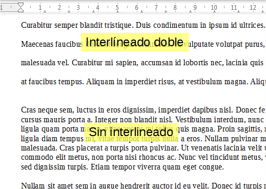
- In English, "leading", which is pronounced 'ledding', refers to the space between lines of letters. An excessively tight line spacing can cause tension and overlap, making content unreadable, and a very wide line spacing can also cause the letters to be dissociated or scattered, so we usually try to find a good balance between the two.
- es: En inglés, “leading”, que se pronuncia ‘ledding’, se refiere al espacio entre líneas de letras. Un interlineado excesivamente apretado puede ocasionar tensión y traslape, haciendo el contenido ilegible, y un interlineado muy amplio, igualmente puede ocasionar que las letras se vean disociadas o dispersas, por lo que normalmente intentamos encontrar un buen balance entre ambos.
- Isotipo
- It is a type of logo where a symbol is used instead of the company name; for example, the Apple logo. Isotypes are commonly accompanied by a logo, but not always.
- es: Es un tipo de logo en donde se utiliza un símbolo en lugar del nombre de la empresa; por ejemplo, el logotipo de Apple. Los isotipos están acompañados comúnmente por un logotipo, pero no siempre.

- Jerarquía/Hierarchy
- It is the visual arrangement of design elements in a way that signifies their importance. For example, you can make a large and thick headline to ensure that it attracts more attention than a small one with a lightly colored image.
- es: Es el acomodo visual de los elementos de diseño de una forma que signifique su importancia. Por ejemplo, puedes hacer un título grande y grueso para asegurar que atraiga más la atención que uno pequeño con una imagen ligeramente coloreada.

- Kerning
- It is the setting of the space between two characters in your typeface. Kerning generally seeks to achieve a more proportional and attractive balance of space between each character.
- es: Es el ajuste del espacio entre dos caracteres en tu tipografía. El kerning, por lo general, busca lograr un equilibrio de espacio más proporcional y atractivo entre cada carácter.

- Legibilidad/Readability
- It is the measure of how easy it is to distinguish one letter from the next. Readability has a lot to do with your choice of font and the way you use it; for example, serif or sans serif typefaces are generally better for smaller text bodies.
- es: Es la medida de lo fácil que es distinguir una letra de la siguiente. La legibilidad tiene mucho que ver con tu elección de tipografía y la forma en la que la utilizas; por ejemplo, tipografías serif o sans serif generalmente son mejores para cuerpos de texto más pequeños.

- Líneas Huérfanas y Viudas/Orphan and Widow Lines
- They are the words or short lines that appear alone at the top or bottom of a column or paragraph. It is always a good (and easy) idea to review your body text before finishing it, and manually delete them when they appear.
- es: Son las palabras o líneas cortas que aparecen solas en la parte superior o inferior de una columna o párrafo. Siempre es una buena (y fácil) idea revisar tu cuerpo de texto antes de terminarlo, y eliminarlas manualmente cuando aparezcan.
- Logotipo/Logo
- It is a type of logo where the name of the company is designed in a visual way. Think of brands like Google, Ikea, Disney.
- es: Es un tipo de logo en donde el nombre de la empresa es diseñado de una forma visual. Piensa en marcas como Google, Ikea, Disney.
- Lorem Ipsum
- Also called a 'draft', lorem ipsum is generic filler text used when text is not available. Used as a placeholder to demonstrate what a design would look like once the actual body text has been included.
- es: También llamada como ‘borrador’, lorem ipsum es un texto genérico de relleno utilizado cuando el texto no está disponible. Se utiliza como marcador de posición para demostrar cómo se vería un diseño una vez que se haya incluido el cuerpo del texto real.

- Marca/Mark
- It is a set of concepts, ideas and emotions that encapsulate the values and ethics of your company. A brand is a mix of all the fine conceptual details that make up the company, from the content that the brand promotes, the way employees express themselves, the words they use, the values they uphold, etc.
- es: Es un conjunto de conceptos, ideas y emociones que encapsulan los valores y ética de tu empresa. Una marca es una mezcla de todos los detalles conceptuales finos que conforman la empresa, desde el contenido que promueve la marca, la forma en la que los empleados se expresan, las palabras que utilizan, los valores que mantienen, etc.

- Márgenes/Margins
- It is the space around the edge of a page. By increasing or decreasing the size of your page margins, you can create a more relaxed or edgy layout, respectively. The example below has more open margins.
- es: Es el espacio que se encuentra alrededor del borde de una página. Al aumentar o disminuir el tamaño de los márgenes de tu página, puedes crear un diseño más relajado o tenso, respectivamente. El ejemplo de abajo tiene márgenes más abiertos.

- Monocromo/Monochrome
- It is a color scheme built from a single color, including lighter and darker shades of the same color.
- es: Es un esquema de color construido a partir de un solo color, incluyendo tonos más claros y más oscuros del mismo color.

- Opacidad
- It is the degree of transparency that an element has. The lower the opacity, the more transparent the element will be.
- es: Es el grado de transparencia que tiene un elemento. Entre más baja sea la opacidad, más transparente será el elemento.

- Paleta/Palette
- It is the selection of colors that you can choose to use in your design.
- es: Es la selección de colores que puedes elegir para usar en tu diseño.

- Pantone (PMS)
- The ‘Pantone Matching System’, or ‘Pantone Color Balance System’, is a standardized system of colors for printing. Each Pantone color is numbered, making it easy to reference and identify exact color shades.
- es: El ‘Pantone Matching System’, o ‘Sistema de Equilibración de Colores Pantone’, es un sistema estandarizado de colores para impresión. Cada color Pantone está numerado, facilitando la referencia e identificación de tonos exactos de color.

- Regla de Tercios
- The Rule of Thirds is a theory that says that if you divide your image with two vertical lines and two horizontal lines, the areas where the lines intersect will be the focal points of your design.
- es: La Regla de Tercios es una teoría que dice que si divides tu imagen con dos líneas verticales y dos líneas horizontales, las áreas en donde intersectan las líneas serán los puntos focales de tu diseño.

- Resolución/Resolution
- It is the amount of detail in an image. Generally speaking, the higher the resolution, the better your images will appear and the more details will be processed, while lower resolution images or graphics tend to look fuzzy, pixelated, or cloudy.
- es: Es la cantidad de detalle de una imagen. En términos generales, entre más alta sea la resolución, mejor apariencia tendrán tus imágenes y más detalles se procesarán, mientras que las imágenes o gráficos con menores resoluciones tienden a verse borrosas, pixeladas o turbias.

- Resolución/Resolution
- It is the amount of detail in an image. Generally speaking, the higher the resolution, the better your images will appear and the more details will be processed, while lower resolution images or graphics tend to look fuzzy, pixelated, or cloudy.
- es: Es la cantidad de detalle de una imagen. En términos generales, entre más alta sea la resolución, mejor apariencia tendrán tus imágenes y más detalles se procesarán, mientras que las imágenes o gráficos con menores resoluciones tienden a verse borrosas, pixeladas o turbias.

- RGB
- RGB, from the English ‘Red, Green, Blue’, or ‘Red, Green, Blue’, is a color model used for display purposes. RGB is an additive color, which means that when mixing colors, we start with black and end with white as we add more color.
- es: RGB, del inglés ‘Red, Green, Blue’, o ‘Rojo, Verde, Azul’, es un modelo de color que se utiliza para propósitos de pantalla. RGB es un color aditivo, lo que significa que al mezclar colores, comenzamos con el negro y terminamos con el blanco a medida que agregamos más color.
- Saturación/Saturation
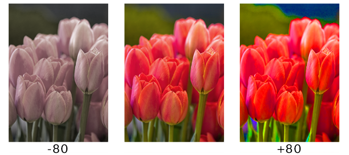
- It is the degree of intensity or vivacity of a color. For example, a color with low saturation may appear paler and faded, while a more saturated color may appear more vibrant and colorful.
- es: Es el grado de intensidad o vivacidad de un color. Por ejemplo, un color con baja saturación puede parecer más pálido y desvanecido, mientras que un color más saturado puede parecer más vibrante y colorido.
- Script o Manuscrita/Script or Handwritten
- It is a typeface that mimics cursive writing. Script or handwritten fonts tend to look elegant, personal, and / or more casual, depending on how embellished they are.
- es: Es una tipografía que imita la escritura cursiva. Las tipografías script o manuscritas suelen verse elegantes, personales y/o más casuales, dependiendo en qué tan embellecidas estén.

- Slab Serif
- It is a typeface with thicker and square serifs, commonly used in headings and titles, but rarely in the body of the text. Slab serif typefaces tend to look sturdier, stronger, and thicker.
- es: Es un tipo de letra con serifas más gruesas y cuadradas, usado comúnmente en encabezados y títulos, pero raramente en el cuerpo del texto. Las tipografías slab serif suelen verse más robustas, fuertes y gruesas.

- Teoría del Color/Theory of color
- It is the study of how colors make people feel and respond. Certain colors tend to evoke certain subconscious emotions and feelings in people - for example, we tend to associate blue with trust and reliability, therefore many corporate companies have blue logos and marks.
- es: Es el estudio de cómo los colores hacen que las personas se sientan y respondan. Ciertos colores suelen evocar ciertas emociones y sentimientos subconscientes en la gente – por ejemplo, tendemos a asociar al azul con la confianza y la fiabilidad, por lo tanto, muchas empresas corporativas tienen logotipos y marcas azules.

- Textura/Texture
- When it comes to design, texture refers to the actual touch surface of a design, or the visual tactility of your design. By overlaying textured images and graphics on top of your design, you can usually create a tactile visual appearance that reflects the actual texture.
- es: Cuando se trata de diseño, la textura se refiere a la superficie táctil real de un diseño, o la tactilidad visual de tu diseño. Al superponer imágenes y gráficos con textura sobre tu diseño, normalmente puedes crear una apariencia visual de tactilidad que refleja la textura real.

- Tipo de Letra Sans Serif/Sans Serif Typeface
- It is a typeface without small decorative strokes. Sans serif typefaces tend to look more modern, elegant, and cleaner than their serif counterparts.
- es: Es un tipo de letra sin pequeños trazos decorativos. Los tipos de letra sans serif suelen verse más modernos, elegantes y limpios que sus homólogos con serif.

- Tipo de Letra Serif/Serif Typeface
- It is a typeface with small decorative strokes (called ‘serifs’, or serifs) that are at the end of horizontal and vertical lines. Serif typefaces often have a professional, authoritative, and traditional appearance.
- es: Es un tipo de letra con pequeños trazos decorativos (llamados ‘serifs’, o serifas) que se encuentran al final de las líneas horizontales y verticales. Los tipos de letra serif suelen tener una apariencia profesional, autoritativa y tradicional.

- Tipografía de Exhibición/Display Typography
- It is the typeface or font designed with the aim of attracting attention. Think of movie titles on posters, magazine article titles, newspaper headlines, etc.
- es: Es la tipografía o fuente diseñada con el objetivo de atraer la atención. Piensa en los títulos de las películas en los pósters, títulos de artículos en revistas, encabezados de periódicos, etc.
- Tipografía/Typography
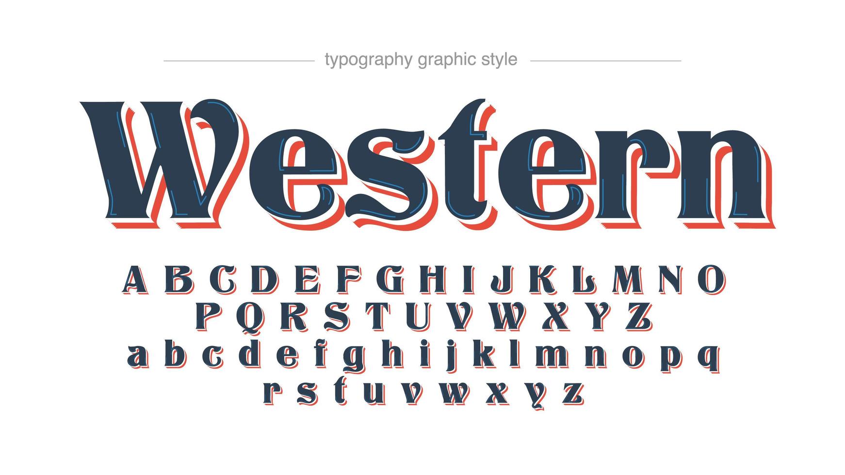
- It is the artistic arrangement of the letter in a legible and visually attractive way. Typography generally refers to the design and use of various types of characters in a way that helps to better communicate ideas visually.
- es: Es el arreglo artístico de la letra de una forma legible y visualmente atractiva. La tipografía, por lo general, se refiere al diseño y uso de varios tipos de caracteres de una forma que ayude a comunicar mejor, visualmente, las ideas.

- Tracking
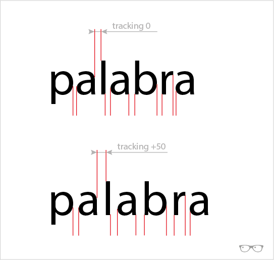
- Tracking refers to the space between letters. When we apply tracking to texts, we are adjusting the space between each letter of the words to change the density or appearance of a text block (for example, of the body of the text). Tracking should not be confused with kerning, which refers to the spacing between individual pairs of letters.
- es: El tracking se refiere al espacio entre letras. Cuando aplicamos tracking a textos, estamos ajustando el espacio entre cada letra de las palabras para cambiar la densidad o apariencia de un bloque de texto (por ejemplo, del cuerpo del texto). El tracking no debe confundirse con el kerning, que se refiere al ajuste de espacio entre pares individuales de letras.
- Triádico/Triadic
- It is a color scheme constructed from three colors equally spaced around the color wheel or color wheel.
- es: Es un esquema de color construido a partir de tres colores igualmente espaciados alrededor del círculo cromático o rueda de color.
- Troquelado/Die cut
- It is the process of cutting areas of your printed design into various shapes to create unique effects. Die cutting is done after printing and is classified as a finishing process.
- es: Es el proceso de cortar áreas de tu diseño impreso en varias formas para crear efectos únicos. El troquelado se realiza después de la impresión y se clasifica como un proceso de acabado.
